Monday, October 24, 2011

ambette at MarkIt @ Fed Square


After selling online for the past not-quite-2-years, I've decided to take the plunge and finally do a market stall. I'm throwing myself right into the deep end and going straight for the big fish.

Crazy? Maybe!

I'm really looking forward to doing it and seeing how it goes. I think one of the downsides to selling online is not being able to gauge the customer's reaction to your product (unless they they leave feedback), so I think it'll be a worthwhile exercise even just for that.

One of the things I've found a little difficult in preparing for the market, is trying to figure out how much stock of each product I need to make. I've been told by people who have done MarkIt before that 'you will sell a LOT', but that's kind of a 'how long is a piece of string' piece of advice. I've had a look at pictures from past MarkIts and the place looks like it gets pretty packed. So I've worked out roughly how many items I could sell if I was being 100% optimistic (which I admit is a pretty arbitrary figure anyway) and then added some more to that so if by some miracle I do as well as I hope, I won't run out of stock. To work out what proportion of each product I should make, I did a Facebook survey, and I'm basing my numbers roughly on that.

The Facebook survey estimated that roughly 55% of my products should be iPhone cases, which makes sense to me, given that every second person seems to have one (plus they're at a lower price-point), then Macbook sleeves (22%), iPad sleeves (18.5%) and Kindle cases (3.7%).

Colours and styles are even harder to predict, but I'm just going to go with a variety and hope for the best.

I'm starting to plan in my head what the stall should look like, but because my products are quite boxy/flat shapes I'm still trying to work out how I can put it all together with varying heights to make it look more interesting.

Also, thrown into the mix, just to make life more interesting for me, I've just accepted some full-time temp work until the end of the year (starting tomorrow), so now I'll be doing all of this outside of normal work hours. I predict much caffeine will be consumed in the next 5 weeks.


Anyway I hope to see some of you Melbourne people on the 27th! There will be lots of other great stalls there, and it's going to be just in time for Christmas shopping (I can't believe I've just mentioned the 'C' word - where has the year gone?!).

Tuesday, July 12, 2011

Tutorial: Correcting white backgrounds on product photos using Photoshop

How to fix your photos!

Before After

Have you ever taken a product photo where the angle and focus were all perfect but your nice white background has come out a weird shade of blue (or some other colour)? I know the way to avoid it is to get your white balance right before taking the photo, but what if it's too late and you just want to salvage the photo Sometimes there's only a small bit of discolouration on an otherwise good photo - seems a shame to have to re-do it.

I have to be honest, I'm not a super-awesome photographer, so I don't know all that much about setting white balance. I usually just set it on auto and hope for the best. There's been more than one occasion where a slight blue tint has ruined a photo.... or so I thought!

I've written a bit of a tutorial below on an easy way to use Photoshop to eliminate the dreaded blue tint from your white background. Hopefully you get something out of it if you're struggling a bit with keeping the ol' white background white.

Just as a disclaimer - I'm obviously not a professional photographer or photoshopper, so I'm sure there are probably other ways to do this, but this is just what I've found works well for me and I thought I'd share. Also unfortunately this tutorial isn't going to be much good to you if you don't use Photoshop (sorry!).


Tutorial:

* It might help to click on the images if you want to see a larger size. It's a bit hard to read the text at their current size.


Right, so I picked out a bit of a doozy to use as an example. Most of my photos don't turn out like this (honest!). This photo has a few problems:

  • Firstly, the background is pretty obviously not white.
  • Secondly, there are some dark patches in the corners that I'd like to even out a bit.
  • Thirdly, there was a dark patch in the bottom right (due to a busted camera) which I've already gone over roughly with the clone stamp, but it's left a bit of a patch that's slightly lighter than the surrounding colour.
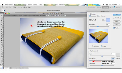
So, what I generally use to fix background colour is the 'replace colour' function, which you can find by going to 'Image' and then 'Adjustments' from the drop-down menu. 'Replace colour' is all the way down the bottom.


Once you have the little toolbox thingy open, you'll notice that when you wave your cursor over the image, it's now a little eye-dropper.


The next step is to take your little eye-dropper and click it on a part of the background that appears blue (or discoloured). Once you do that, you'll see that the colour box next to the 3 blue sliders changes colour to what you just clicked on. If the blue tint is so slight that you're not sure if it's just your eyes playing tricks on you, I find it handy to compare that box to the grey colour surrounding it. Once the colour is right next to the grey, it seems to jump out at you if it's got any colours it shouldn't.


So once you've selected your colour, slide the 'Saturation' slider all the way over to the left. That will remove any colour and leave behind only shades of grey. If your image is like the one above, you might find that doing this will not immediately remove all the blue from the background. If this is the case, when you've removed the first lot of blue, click 'ok' then go back into the 'Replace colour' function again. Repeat the desaturation process on all areas of blue until the entire background is colour-neutral.

To even up the light and dark patches, it's basically the same as removing the blue, except you use the 'Lightness' slider instead of 'Saturation'. If you want, you can lighten up dark patches at the same time you desaturate them. That's usually what I do. Once you've eliminated all the discolourations from your background and evened up the light and dark patches, you should end up with something a bit like this:


For me, the background of the image is still a bit grey. At this point you can do one of a few things:
  • If you're happy with the amount of light on your actual product, but it's just the background that needs lightening, go back into 'Replace colour', select the background with the eye-dropper (which by now should all be pretty much the same tone) and just lighten it up a bit. The only thing to be careful with here is if your product has light colours, because when you select the light background, anything else that is the same tone will be lightened along with the background. You could also play around with the exposure if you feel like the whole image is a bit under-exposed.


  • If the whole image needs brightening up, you can try adjusting the brightness, which you can change by going to 'Images', then 'Adjustments' from the drop-down menu, and select 'Brightness/Contrast'. Just play around with the sliders until you're happy with the result.


After all is said and done, you should end up with something that has a nice clean, bright background.


This photo certainly isn't my best product shot by any stretch, but when you compare what it was like originally to what it's like now, it's a damn sight better!


Hope this was useful to you! Happy to answer questions if you've got any.

Wednesday, June 22, 2011

I need your opinion

I'm thinking about putting an ad on a decent-sized design blog and have been putting together some graphics. I think it'll look something like the images below, but I can't decide which one is the most 'clickable'. Which one do you think I should go with? Is there anything you think I should add to it?


Edited: This final design (bottom right) I just added to the options. It's a cleaner font than my logo, but I've changed it a bit so it looks more like my original logo, and a bit less boring than the design on the left. What do you think?

Any feedback would be fab!